Archives de catégorie : Publications

L’effeuillage des effacements

2016

Cancelation shedding

stack, 151 unique posters, 61 X 85 cm, matte black inkjet printing, Design Vier5.

A self-service pile of posters, characterising around 150 historical episodes (one per poster) of debt cancelation in reverse chronological order from 2015 to 2400 BC. Designed by Vier5, the posters here, then, in contrast to a usual stack, are all different to one another in both content and design. As they are taken away by the public, a veritable history of cancelling takes place in a sort of counter-history of indebtedness. Wiping the slate clean takes place, here, in the context of a multiplicity of political ambitions, from decolonialisation or populist measures to guarantee the success of a coup d’état to the neoliberal strategy of conditioning private sector privatisation as the counterpart to debt forgiveness.

stack, 151 affiches uniques, 61 X 85 cm, impression jet d’encre noir mat, Design Vier5.

Pile d’affiches en libre service, rassemblant dans un ordre chronologique décroissant environ cent-cinquante épisodes historiques d’annulation de dette, de 2015 à 2400 av. J.-C., à raison d’un événement par affiche. À la différence des stacks habituels, chaque affiche est donc ici différente, dans son contenu, mais aussi son design, réalisé par Vier5. À mesure que les affiches sont emportées par le public, c’est une véritable histoire de l’annulation qui se fait jour, sorte de contre-histoire de l’endettement. L’effacement des ardoises y apparaît alors motivé par une multiplicité d’ambitions politiques, où l’émancipation de la décolonisation côtoie la mesure populiste à même de garantir le succès d’un coup d’état, en passant par la stratégie néolibérale imposant en échange la privatisation du secteur public.

Collections: FRAC Franche-Comté, Fondation Kadist.

Saladin Dettes 1502_

Filigrane (Ne prenez pas tout ce qu’on vous donne)

2016

Inscription on communication documents, variable dimensions.

The injunction « Don’t take everything you are given » is printed in watermark on the various communication supports of the exhibition.

Inscription sur documents de communication, dimensions variables.

L’injonction “Ne prenez pas tout ce qu’on vous donne.” est imprimée en filigrane sur les différents supports de communication de l’exposition.

Collection : FRAC Franche-Comté.

La dette n’est qu’une promesse

2016

Debt is nothing but a promise

Three embossing machines are left at the disposal of the public for them to use on their own bank notes. Each machine prints the same sentence but in a different language (German, French or Greek), using the official European Commission font, embossing the following words in the thickness of the paper: “La dette n’est qu’une promesse” (debt is nothing but a promise).

Trois presses à gaufrer sont laissées à la disposition du public pour qu’il puisse les utiliser sur ses propres billets de banque. Chaque presse imprime la même phrase, mais dans une langue différente (allemand, français ou grec), dans l’épaisseur même du papier, écrite dans la police de caractères officielle de la commission européenne : « la dette n’est qu’une promesse ».

Collection : FRAC Franche-Comté.

saladin_vue_expo_2

Calendrier des révoltes 2015

Calendar of Revolts takes the form of a calendar for the year 2015 that replaces the celebrations of the patron saints on all 365 days of the year with the anniversaries of popular revolts taken from the pages of modern and ancient history.

Calendrier 2015 où les informations habituelles relatives à chaque jour laissent place à l’unique mention d’une révolte ayant eu lieu ce même jour.

Design Vier5 ; production CAC Brétigny. Poster 84,1 x 59,4 cm, 1100 exemplaires.

Layout 1

Economic Score – Soleil politique

2014

The work Economic Score transposes a cultural economy into a musical score. For the version Economic Score: Soleil politique, the exhibition budget, including production costs and private financial support, has been transcribed as a musical score. The score will be performed on October 29, 2014, during Bolzano’s Festival of Contemporary Music. The work refers to aspects of social and economic life that, given their immaterial nature and omnipresence, escape direct perception and yet nevertheless dictate and mold attitudes, discourses, social relations, and daily activities. The ideological imprint of material production is appropriated as a medium in order to investigate the tensions of social space, along with the relation between aesthetic perception and the economic activities that govern it.

Performed by Air-Borne Ensemble, on October 29, 2014.

La pièce Economic score consiste en la transposition d’une économie culturelle en partition. La version « Soleil politique, 2014 » comprend 3 tables à utiliser conjointement dans la préparation de l’interprétation. Elle reprend le budget de l’exposition Soleil politique (commissariat Pierre Bal-Blanc), Museion, Bolzano, 26/09/2014 – 11/01/2015.

Interprétée par l’ensemble Air-Borne, le mercredi 29 octobre 2014.

11579_729929760429105_1484032678701317129_n

Economic Score – CAC Brétigny

2013

The work Economic Score consists in transposing a cultural economy into a musical score. The present version refers to the budget of CAC Brétigny in 2013. The score consists of 3 tables to be used jointly in preparing the performance.

Performed by DEDALUS ensemble, on December 14, 2013

La pièce Economic score consiste en la transposition d’une économie culturelle en partition. La version « CAC Brétigny, 2013 » comprend 3 tables à utiliser conjointement dans la préparation de l’interprétation.

Interprétée par l’ensemble DEDALUS, le samedi 14 décembre 2013

economic score2 economic score3

Deadalus_14_14

Sounds of silence

Sounds of silence

LP, produced by Frac Franche-Comté / Alga Marghen, with Incertain Sens, 2013. Project realized with Patrice Caillet et Adam David.

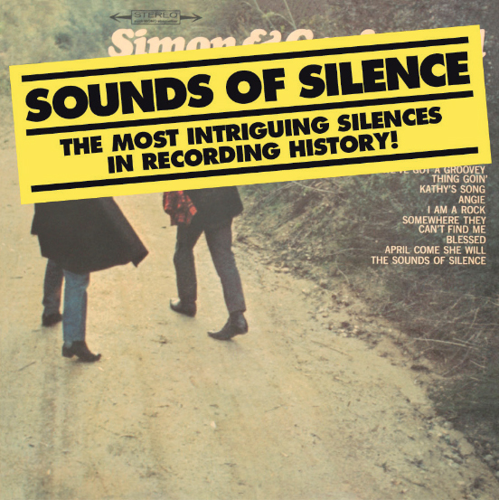
Sounds of Silence is an anthology of some of the most intriguing silent tracks in recording history and includes rare works, among others, by Andy Warhol, John Lennon, Maurice Lemaître, Sly & the Family Stone, Robert Wyatt, John Denver, Whitehouse, Orbital, Crass, Ciccone Youth, Afrika Bambaataa, Yves Klein, etc. In their own quiet way, these silences speak volumes: they are performative, political, critical, abstract, poetic, cynical, technical, absurd… They can be intended as a memorial or a joke, a special offer, or something entirely undefined. The carefully chosen silences of this anthology are intrinsically linked to the medium of reproduction itself and reveal it’s nude materiality. They expose their medium in all its facets and imperfections, including the effect of time and wear. At the most basic level, these silences are surfaces. And it is in their materiality that they distinguish themselves from the conceptual experiments of John Cage with 4’33 ». From the 1950s silence has found a place in the economic structure of the record industry and since then it would increasingly be appropriated by a vast array of artists in a vast array of contexts. Indeed, the silent tracks seem to know no boundaries. The LP presents the silences as they were originally recorded, preserving any imperfection that the hardware conferred upon the enterprise, without banning the possibility to satisfying the ear. The liner notes provide historical background for each track, revealing the stated (or presumed) motivations for these silences, while providing novel sound correspondences or interferences. This album is meant to be played loud (or not), at any time, in any place: a true aural experience.

4 editions between 2023 and 2022. Available here

Disque vinyle 12’, Frac Franche-Comté / Alga Marghen, avec le soutien
des éditions Incertain Sens, 2013. Projet réalisé avec Patrice Caillet et Adam David.

« Sounds of silence » est une anthologie réunissant certains des plus intriguants morceaux de silence de l’histoire de l’enregistrement et comprend des pièces d’Andy Warhol, John Lennon, Maurice Lemaître, Sly & the Family Stone, Robert Wyatt, John Denver, Whitehouse, Orbital, Crass, Ciccone Youth, Afrika Bambaataa, Yves Klein, etc. Si tous ces morceaux ont en commun un même et unique matériau, et peuvent en cela paraître au premier abord interchangeables, ils sont en réalité on ne peut plus divers. Ainsi, oscillent-ils entre le performatif, le mémoriel, le politique, la critique, l’abstraction, le poétique, le cynisme, la blague, la technique, la promotion, l’absurde et l’indéterminé. Les morceaux choisis de cette anthologie rendent néanmoins tous compte de la spécificité de silences pensés et produits pour un médium reproductible, jouant de sa matérialité en le mettant à nu. Ils exposent et révèlent leur médium, jusque dans son usure et ses imperfections. Ce sont de simples surfaces, des spirales de sillon tournant sur elles-mêmes. Pour cette même raison, ces plages de silence se distinguent de la rupture conceptuelle opérée par John Cage avec 4’33’’. Depuis les années 1950, le silence a trouvé une place dans l’économie du disque et a connu d’innombrables appropriations. La plage de silence paraît en effet ne faire exception à aucun courant musical. « Sounds of silence » rejoue ces silences d’après leur support d’origine, conservant toutes les imperfections liées à leur matérialité propre et leur histoire spécifique, sans toutefois négliger le postulat d’une certaine satisfaction d’écoute chez l’auditeur. Cette approche documentée révèle les motivations effectives ou présumées de ces silences, tout en s’aventurant dans des correspondances ou des interférences inédites. Un disque « à jouer fort » (ou non), en tout lieu et toute circonstance : une réelle expérience auditive.

4 éditions, entre 2013 et 2022. Disponible ici.

Collection FRAC Normandie.

Parole au futur antérieur

N° 114 juillet-août 2013, Production CAC Brétigny

Parole in the future perfect

Each month, the inhabitants of Brétigny receive Parole, ‘the magazine on Brétigny for the people who live there’. Published by the municipality, it informs the inhabitants of Brétigny-sur-Orge on municipality news, important dates, articles on everyday life, the policies implemented by the elected officials, the opposition opinion column, work underway and practical information. In the summer edition (July-August 2013), the magazine was duplicated in a facsimile which was conjugated in the future perfect. This change in tense created an incongruity with the news by disturbing the temporality in which a monthly is usually written. The future perfect is an unusual tense in French in as much as it combines both the future and the past: that which hasn’t yet taken place with that which has already happened. By introducing this slight linguistic disruption, Parole in the future perfect brings readers to question themselves about their relationship with the publication and the political, cultural and social goings-on in the town in which they live.

Chaque mois, les Brétignolais reçoivent Parole, « le magazine qui parle de Brétigny aux Brétignolais ». Publié par la municipalité, il présente l’actualité de Brétigny-sur-Orge à ses habitants, les rendez-vous marquants, des dossiers sur la vie de tous les jours, la politique menée par les élus, la tribune de l’opposition, les travaux en cours et les informations pratiques. À l’occasion de son numéro d’été (juillet-août 2013), la revue se voit doublée d’un facsimilé dont la particularité est d’être conjugué au futur antérieur. Ce changement de temps opère un décalage par rapport à l’actualité, en troublant la temporalité dans laquelle s’inscrit d’ordinaire un périodique. Le futur antérieur est en effet un temps singulier dans la conjugaison française, en ce qu’il réunit à la fois le futur et le passé, ce qui n’a pas encore eu lieu et ce qui est déjà révolu. En introduisant cette légère perturbation dans la lecture, Parole au futur antérieur amène les lecteurs à s’interroger sur leur rapport à cette publication, à l’actualité politique, culturelle et sociale de la ville où ils habitent.

Version PDF disponible ici.

Opinions

Artist book published by éditions Incertain Sens & CAC Brétigny, 2013.

This book represents the results of 50 surveys carried out since the beginning of the 21st century on both economic and political and social and cultural issues by the main French opinion poll organisations (BVA, CSA, IFOP, TNS Sofres, etc.). The percentages of the answers given to each question reconfigure the width of the different bands of colour in the French flag, which retains its official overall proportions (2:3). Answers that correspond to the first part of an answer, or “yes”, go to making up the blue section of the flag; answers that correspond to the second part of an answer, or “no”, go to  making up the red section; in the middle, unanswered questions (undecided) go to making up the white section. The composition of colours generated for the question posed therefore distorts the French Republican emblem according to “public opinion”. In the Wikipedia entry for the “French flag”, it says that for a long time the three bands of colour weren’t the same width (this is the case for the flag for Paris and this practise continued during the revolution). It is only since Napoleon Bonaparte, on the advice of the painter Jacques-Louis David, that the regulation was established instituting bands of colour of equal width. The use of statistics to predict the future also became more commonplace in the 18th century, with the opinion poll – in which “the whole can be represented by a proportion of the whole” – becoming associated with the idea of representativity. One of the paradoxes of these surveys, which is all the more apparent today as they now seem to cover even the minutest aspects of social life, is that they both aim to give public opinion, which is presented as the “truth of the people” – but which, in terms of its expression, if not its calculation, remains subject to caution –, and tend, to borrow the words of French philosopher Jacques Bouveresse, in terms of the very principle of the statistics of which they are composed, to make “individuals, ideas and events almost entirely interchangeable”.

Livre d’artiste publié par les éditions Incertain Sens et le CAC Brétigny, 2013.

Ce livre reprend 50 sondages réalisés depuis le début du XXIe siècle par les principaux instituts de sondage français (BVA, CSA, IFOP, TNS Sofres, etc.), touchant aussi bien à des questions économiques et politiques que sociales et culturelles. Les pourcentages des réponses données à chaque question reconfigurent la largeur des bandes du drapeau français, en conservant toutefois ses couleurs et ses proportions (2:3) officielles. Le premier élément de réponse ou la réponse « oui » correspond à la couleur bleue ; le deuxième élément de réponse ou la réponse « non » à la couleur rouge ; au milieu, la part des sans réponses (ne se prononcent pas) équivaut au blanc. La composition de couleurs ainsi générée fait face à la question posée, distordant au gré de l’« opinion publique » cet emblème de la République française. À l’entrée « drapeau de la France » dans Wikipédia, on peut lire que pendant longtemps, les trois bandes n’avaient pas la même largeur (c’est le cas du drapeau de Paris et cet usage s’est conservé durant la révolution). Il apparaît que c’est seulement depuis Napoléon Bonaparte et sur les conseils du peintre Jacques-Louis David que la réglementation instituant des bandes de largeur égale a été établie. C’est également au XVIIIe siècle que le rôle prévisionnel des statistiques se met en place, le sondage – où « la partie peut remplacer le tout » – devenant à leur suite associé à l’idée de représentativité. L’un des paradoxes de ces sondages, d’autant plus manifeste aujourd’hui que le moindre aspect de la vie sociale ne semble pouvoir leur échapper, est qu’à la fois ils entendent livrer une opinion publique faisant office de « vérité du peuple » – qui pourtant dans son expression, sinon son calcul, reste sujette à caution –, et que dans le principe même de leurs statistiques, ils tendent à rendre, pour reprendre les mots de Jacques Bouveresse, « les individus, les idées et les événements presque complètement interchangeables ».

Orientation

2011-2013

Cards 10.5 x 14.8 cm. Each card reproduces a wind rose indicating north and must be laid out accordingly so as to ensure correct orientation. Piles of these cards are made available in various cultural and artistic spaces and places frequented by tourists, as orientation flyers.

Cartes, 10,5 x 14,8 cm. Chaque carte reproduit une rose des vents indiquant le nord et doit être disposée de telle sorte que l’orientation soit la bonne. Des piles de ces cartes sont laissées à disposition dans différents lieux culturels, artistiques et touristiques, tels des flyers d’orientation.

IMG_1178bis